revamping smeg

the analysis

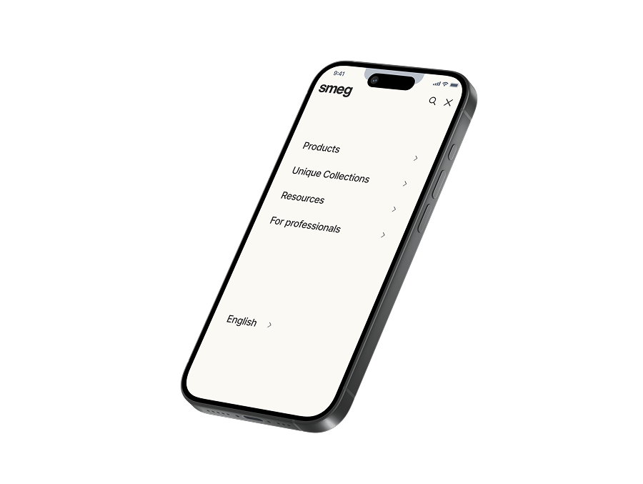
the UX audit revealed several key issues across the Smeg website that impact usability and engagement. The navigation and homepage were cluttered and unclear, with confusing categories and poor structure. The product list page lacked visual hierarchy and effective filtering, making it hard for users to browse confidently. The product description page had minimal visual storytelling and unclear content, making product exploration feel incomplete. These findings informed the direction for improvement in the redesign.nside of a div block.

The focus

now focusing on enhancing usability, visual clarity, and brand storytelling. The navigation was simplified across devices for better structure and accessibility. The homepage used bold typography and immersive imagery to highlight products and brand identity. The Product List Page featured a clean, interactive layout with improved filtering, while the Product Description Page emphasized product visuals and streamlined content for a smoother user journey.

the design-system

Background
#FFFFFF
Accent
#3e3e3e
Accent #2
#fbf9f4
Accent #3
#c0d4ea
Accent #4
#bcdfc8
Accent #5
#fff7e1
Accent #6
#f1eacc
Accent #7
#EECAE0

the highlights

Simplified navigation enhances clarity

The redesigned navigation features a cleaner layout with reduced clutter, full-width dropdowns, subtle interactions, and a more minimal search experience—enhancing clarity and ease of use across all devices.

usually Engaging Homepage Designed to Inspire

The redesigned homepage uses dynamic visuals, interactive product showcases, and consistent animations to create a seamless, immersive experience that highlights products, tells brand stories, and keeps users engaged without disrupting the browsing flow.

Interactive List That Keeps the Focus on Visual Discovery

The redesigned Product List Page highlights Smeg’s products through immersive visuals, modern carousels, engaging hover animations, and a cohesive layout, creating a smooth and visually-driven browsing experience.

Simplified, Visual-First Product Experience

The redesigned Product Description Page features a clean, focused layout that prioritizes imagery, simplifies content, and uses subtle interactive elements to guide users—creating a clear, seamless, and visually engaging experience.